

What a scanner actually sees
A phone’s scanner turns the camera image into light and dark, then looks for the pattern. The hue barely matters. What matters is the difference in brightness between the code and its background. That’s why a dark red code on cream scans and a bright yellow one on white doesn’t, even though the yellow looks more vivid.
The handiest measure of that difference is the contrast ratio used for text on websites (WCAG). It runs from 1:1, no difference at all, to 21:1, black on white. Any online contrast checker will give you the ratio for two colours.
| Code colour on background | Contrast | Verdict |
|---|---|---|
| Black #000000 on white | 21:1 | Scans anywhere |
| Navy #1B2A4A on white | 14.2:1 | Excellent |
| Dark green #1E5631 on cream #FBF7EF | 8.1:1 | Excellent |
| Purple #6B3FA0 on white | 7.4:1 | Very good |
| Dark red #A61E3C on white | 7.3:1 | Very good |
| Teal #0A7A8D on white | 5.0:1 | Good |
| Raspberry #D9446F on white | 4.2:1 | Borderline: test it carefully |
| Mid grey #8A8A8A on white | 3.5:1 | Risky in poor light |
| Orange #F28C28 on white | 2.5:1 | Unreliable |
| Sky blue #5DADE2 on white | 2.5:1 | Unreliable |
| Gold #FFC845 on white | 1.5:1 | Won’t scan |
How much contrast is enough
We tested this for our own studio. We printed codes in ten hues at contrasts from 2.5:1 to 7:1, through a model of an office inkjet on plain paper, and photographed them with simulated phone cameras 15–30 cm away, in good light, dim light, shadow and glare. In ordinary conditions every colour from 3:1 upwards scanned exactly as well as black, and the first failures came at 2.5:1. Under stress, such as glare or a low-resolution camera further away, no colour quite matched black, and each step up in contrast helped, with the gains levelling off around 6:1.
So aim for at least 4.5:1. It leaves a margin for poor light, cheap printing and older phones, and it’s the same threshold WCAG sets for ordinary text, which makes it easy to remember.
Keep it dark on light
Scanners expect dark modules on a light background. Keep the code the darker of the two colours, and keep the background light all the way out to the edge of the quiet zone, the margin four modules wide around the code.
A light code on a dark background, an inverted code, is allowed by the current version of the QR standard, and many phone camera apps read one. Not all do, and some scanner apps don’t. If your design is dark, put the code on a light panel within it rather than inverting it. If you do invert it, test on several phones, including an older Android phone and a separate scanner app.
Watch transparent backgrounds
A PNG or SVG with a transparent background takes the colour of whatever it is placed on. Dropped onto a dark flyer, a black T-shirt or a coloured box, a dark code becomes dark on dark. Export it with a solid light background, or put a light box behind the code in your layout, with room for the margin.
Coloured eyes, gradients and frames
- Eyes (the three big corner squares) can be a different colour from the rest, but each needs the same contrast with the background as the code. They’re the first thing a scanner looks for.
- Gradients: check the lightest point of the gradient, not the average. A gradient from navy to sky blue fails where it reaches the sky blue.
- Frames and “Scan me” labels sit outside the quiet zone, so they don’t affect scanning, but their words need to be readable. 3:1 is the usual minimum for large bold text.
- Backgrounds: no photos, patterns or textures behind the code itself. Keep them outside the quiet zone.
Logos and error correction
A logo in the middle covers modules, and the code relies on its error correction to fill them back in. Level H restores about 30% of the code, so a logo code needs H, and the logo should cover well under that. It must never touch the three corner squares, the thin dotted lines that run between them, or the strips beside the corners that hold the code’s format information. A logo on a solid plate, with a little space around it, scans better than one whose edges dissolve into the modules.
A logo also makes the code denser, because level H needs more modules for the same content, so the smallest safe print size goes up. Test a logo code at the smallest size you’ll print, and see our guide to QR code size for printing.
Printing changes your colours
Screens glow; paper reflects. An office inkjet on plain paper dulls colours, lets ink spread into neighbouring modules and prints white as the slightly grey white of the paper, so contrast drops. In our print model, a colour that measured 4.5:1 on screen against a light grey background printed at anywhere from 4.2:1 to 4.9:1, depending on the colour. Leave headroom, and print a proof on the real paper with the real printer.
Metallic inks, foil and glossy finishes reflect light into the camera and can make a code vanish at some angles. Use them for decoration around the code, not for the code itself.
Make it in QR Island
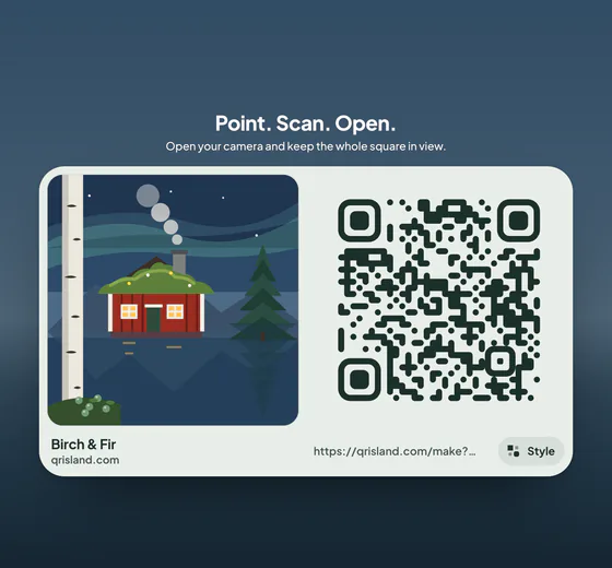
In the studio’s Style panel you can colour the code and its eyes, and add a gradient and a frame for the Island pack. The studio measures each colour as you pick it. Below 4.5:1 for the code, the eyes or a gradient stop, or below 3:1 for a frame’s words, it shows a warning under that colour and offers a darker shade of the same colour, or a swap, in one click.
It never changes your colours on its own: they are drawn exactly as you pick them, on the island, the flat code and every file. Only a design that phones can’t read at all, such as very pale grey on white, waits for a change before you can download or buy it.